Beginner Guide to Mixing Watercolors Like a Pro
Discover three easy secrets in this beginner's guide to mixing watercolors like a seasoned professional. Includes in-depth video tutorial!
Achieving the perfect blend of colors may seem like an elusive skill, requiring countless hours of practice. However, fear not! In this insightful blog post, we will unravel the secrets of mixing watercolors like a seasoned professional.
First and foremost, we will explore the art of managing water and palette, providing you with indispensable techniques to achieve desired consistency and control.
Next, we will delve into the world of color selection, guiding you on how to choose the right hues that harmoniously complement your artistic vision. Finally, we will unveil the creation of a watercolor split primary chart, an invaluable reference tool that will enhance your artistic endeavors, whether you’re painting vibrant florals or breathtaking landscapes.
To Mix Watercolors Like a Pro, Begin with a Split Primary Watercolor Chart
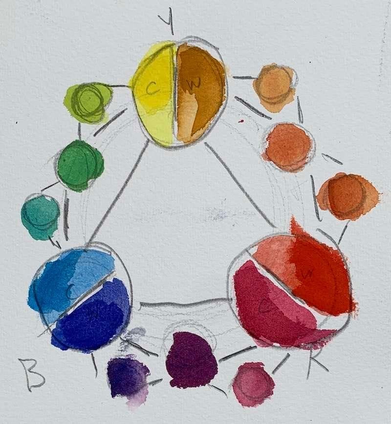
The beginner watercolor artist should begin their mixing journey with a fundamental tool—the split primary chart. This chart holds the key to unlocking a world of infinite color possibilities! By familiarizing yourself with this essential resource, you will effortlessly bring any hue your heart desires to life on your paper.
One important principle to remember is that achieving lighter shades of a color involves starting with a base hue that is already lighter. For instance, if you seek a gentle, pastel-like shade of red, consider using pink as your starting point, rather than pure red straight from the tube.
Furthermore, keep in mind that the addition of water to your mixture serves a similar purpose to adding white to a color, resulting in a lighter value overall.
By grasping the significance of a split primary chart and understanding these foundational concepts, you will be equipped with the knowledge to skillfully blend an array of captivating colors. Step confidently into the realm of watercolor mixing, and watch as your artwork blossoms with newfound vibrancy and depth.
Finding the Perfect Water Ratio for Watercolor Mixing
Before we dip our paintbrushes into vibrant pigments and set them upon our palettes, let’s explore the basics of watercolor mixing. One crucial aspect to grasp is the art of managing water and your palette.
When using a wet palette, it is essential to ensure that its surface is dry before commencing the mixing process. You can employ a paper towel or tissue paper to absorb any excess moisture. However, bear in mind that this method may limit your control when adding drops of paint. There is a possibility that the paint might be absorbed into the paper, rather than remaining on the palette’s surface, where it can be easily picked up by your brush.
Now, you may wonder, how much water should you mix with watercolor paint? Well, there is no definitive answer, as it largely depends on the desired consistency and effect you wish to achieve. As a general rule, it is recommended to begin with a slightly diluted mixture and gradually adjust the water ratio to suit your specific needs. This allows you to exercise greater control over the transparency and flow of your paints.
By understanding the importance of managing water and your palette, you will embark on your watercolor journey armed with the knowledge to create stunning blends and achieve the desired artistic outcomes. So, grab your brush, prepare your palette, and let your imagination dance across the canvas in a symphony of colors!
Choosing the Perfect Watercolor Paints: Unveiling the Palette of Possibilities
When it comes to watercolor painting, selecting the right paints is a crucial step in achieving impeccable color mixing. With countless brands and varieties available, it can be daunting to determine which paints will best suit your project. However, fear not! We’re here to guide you through this artistic conundrum.
While budget considerations play a role, it’s important to note that opting for inferior quality watercolor paints may compromise the overall quality of your color mixing.
For those with a tighter budget, Cotman’s by Winsor & Newton is an excellent choice. This student-grade paint offers a good balance between affordability and satisfactory results, allowing you to achieve the desired effects without breaking the bank.
If your finances permit, investing in artist-grade paints such as Holbein or Daniel Smith is well worth it. These high-quality paints unlock a world of vibrant pigments and superior color mixing capabilities. The richness and intensity of the hues they offer will undoubtedly elevate your artwork to new heights.
To further assist you in making informed decisions regarding the materials you select, we recommend reading our comprehensive article on choosing the right watercolor supplies. This resource will provide valuable insights and guidance, empowering you to curate the perfect toolkit for your artistic endeavors.
Unveiling the Color Palette: Essential Hues for Watercolor Mixing
Once you’ve determined the optimal water-to-paint ratio, it’s time to dive into the world of color mixing on your palette. A fantastic technique to master watercolor paint mixing is by employing a split primary chart. This chart acts as your foundation, providing a starting point for a versatile range of colors while allowing flexibility to introduce additional hues as required.
Allow me to introduce the exact six hues that form the core of this palette:
- Yellow Ochre – a warm yellow tone
- Cadmium Yellow Lemon – a cool yellow tone
- Ultramarine Blue – a warm blue tone
- Cerulean Blue – a cool blue tone
- Alizarin Crimson – a cool red tone
- Cadmium Red Light – a warm red tone
In addition to these vibrant primary colors, it is also beneficial to include neutral shades such as Burnt Sienna, Raw Umber, and Neutral Tint in your palette.
To create your split primary chart, divide the color wheel into three sections: red, yellow, and blue. Within each section, mix two colors that are adjacent to each other on the color wheel. This process will yield a total of six colors, comprising three warm tones (red, yellow, and orange) and three cool tones (green, blue, and purple).
Utilize this chart as your guide to mix an endless array of captivating colors. Remember to commence with light washes and gradually build up darker tones by adjusting the amount of paint or water on your brush before applying it to the paper.
At times, you may find the need to create neutrals or grays. These colors do not appear on the color mixing chart. One common approach is to employ complementary colors, which are hues located opposite each other on the color wheel.
For instance, combining yellow and purple or red and green. However, bear in mind that introducing any additional color into your mixture, apart from the ones being used, will desaturate the resulting hue. This means it will create a more muted or neutral color, lacking the intensity of pure pigments.
Achieving the Perfect Secondary Hues: Green, Violet, and Orange
In our quest to master watercolor mixing, it’s essential to explore the art of creating secondary hues—green, violet, and orange. These captivating colors can be achieved most effectively through the utilization of a split-primary palette. Let’s delve into the specific hues required to produce these vibrant secondary tones.
To achieve the perfect green:
Combine Cerulean Blue (a cool blue tone) with Cadmium Yellow Lemon (a cool yellow tone). By blending these two hues, you will attain a vibrant and balanced green shade.
For a vivid violet: Blend Ultramarine Blue (a warm blue tone) with Alizarin Crimson (a cool red tone). The marriage of these colors will yield a rich and captivating violet hue.
To craft a radiant orange: Mix Cadmium Red Light (a warm red tone) with Yellow Ochre (a warm yellow tone). The harmonious fusion of these warm hues will result in a luscious and vibrant orange shade.
It’s important to note that while these specific hues are recommended for optimal results, it is possible to achieve good secondary colors using alternative pigments as long as the temperature of the colors is appropriately balanced. Remember, maintaining the right temperature relationship between the primary colors used in the mixing process is crucial for obtaining harmonious and visually appealing secondary hues.
Unlocking the Secrets of Mixing Gray and Brown Hues
In the realm of watercolor mixing, achieving the perfect shades of gray and brown opens up a world of possibilities. Let’s explore some valuable tips to guide you in your quest for these versatile and essential colors.
Creating a neutral gray:
To mix a neutral gray, begin by adding a small amount of red, blue, and yellow to your palette. Combining these three primary colors will result in a harmonious gray tone. Adjusting the bias of the hue may be necessary to achieve the desired shade. If the mixture appears too red, introduce a touch of blue or yellow paint. Similarly, if it leans too much towards blue or yellow, add a small amount of the complementary color to balance it. Remember, even small adjustments can have a significant impact on the resulting shade.
Discovering the art of making brown:
Brown hues can be easily crafted by blending red and green. The ratio of these two colors will determine the warmth or coolness of the brown tone. For a warmer brown reminiscent of bricks, increase the amount of red in the mixture. Conversely, for a cooler brown, add more green.
Feel free to experiment with different red and green pigments. For instance, combine Cadmium Red with Hooker’s Green, or mix Alizarin Crimson with Sap Green. Each combination will produce unique variations of brown, allowing you to explore a diverse range of earthy tones.
If you prefer to have ready-made brown hues in your palette, consider incorporating commonly used watercolor pigments such as Yellow Ochre, Burnt Sienna, and Raw Umber. These hues not only offer beautiful browns but also blend harmoniously with other colors, enhancing the versatility of your palette.
Whether you choose to mix your grays and browns or opt for pre-made pigments, mastering these colors will add depth and dimension to your watercolor artwork. So, let your creative spirit roam as you experiment with different combinations, uncovering the beauty of gray and the richness of brown in your artistic endeavors.
Exploring Watercolor Mixing Techniques: Pans vs. Tubes and Easy Steps to Success
A frequently asked question in the realm of watercolor painting is how to effectively mix paint using pans and tubes. Let’s delve into the nuances of each and outline the easy steps to achieve remarkable results.
Watercolor Pans: Watercolor pans resemble hard cakes that require some preparation before use. To activate the paint, begin by adding a small amount of water to the pan. Gradually introduce water until the cake starts to break down and become wet, while still retaining some texture. At this point, you can easily pick up the paint with a brush for application. After using the pan, it is advisable to wipe off excess paint from your brush and allow it to dry, preventing the accumulation of dried paint over time.
Watercolor Tubes: Working with watercolor tubes is generally more convenient since the paint is already in a liquid consistency. However, the paint in tubes may dry out and need to be re-wetted before use, similar to pan paints. Begin by squeezing a small amount of paint onto your palette. Then, gradually add water to the paint using your brush, adjusting the consistency as needed.
Recap of Easy Steps to Mix Watercolors:
- Choose the Right Hues: Utilize a six-primary palette consisting of both warm and cool primary colors. This selection is crucial for achieving perfect secondary and tertiary hues in your color mixing endeavors.
- Paint Consistency and Water Ratio: Determining the appropriate water-to-paint ratio is vital for successful watercolor mixing. You want to ensure that the paint is wet enough to maneuver on your palette but not overly diluted. To test the consistency, dip your brush into the paint and add a drop of water onto the paper. If the color spreads easily, it is ready to be used. If the color remains stationary, add more water until the desired consistency is achieved. Remember that the amount of water used will also influence the value of your paint, with less water resulting in lighter washes and more water leading to darker washes.
- Create a Color Mixing Chart: Unleash your creativity by creating a color mixing chart. This invaluable tool will enable you to become a color ninja, exploring the vast range of hues achievable through various combinations.
In Conclusion:
By following these easy steps and practicing diligently, success in color mixing is within your grasp. While the process of color mixing may seem complex at first, with time and experience, you will master this art form. Feel free to share your watercolor creations and experiences in the comments below. I’m excited to hear how this watercolor mixing guide has enhanced your skills.
If you have any further inquiries or require assistance in your color mixing journey, please don’t hesitate to reach out. Wishing you all the best in your watercolor endeavors, and see you in the next tutorial! Farewell…