Landscape Painting Design and Composition Tips
Strong landscape paintings don’t just happen—they’re designed. In this garage studio lesson, I’ll show you how horizon placement, shapes, and values build a painting that works.


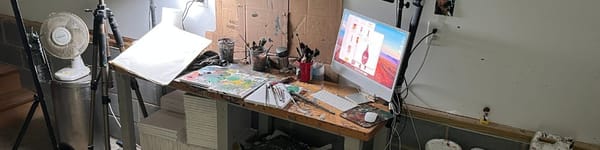
Every time I sit down in the garage studio to paint a landscape, I remind myself: it’s not just about what’s in front of me, it’s about how I arrange it. A good composition is the backbone of every strong painting, and that’s what this lesson is all about.
Why Composition Matters
When you look at a painting and wonder why it works, it almost always comes back to design. Strong landscapes aren’t just happy accidents—they’re built on balance, variety, and structure. In this lesson, I’ll walk you through how to think about horizon placement, shape variety, and value contrast so your landscapes have clarity and impact.
Key Takeaways from the Lesson
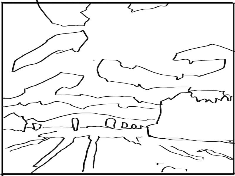
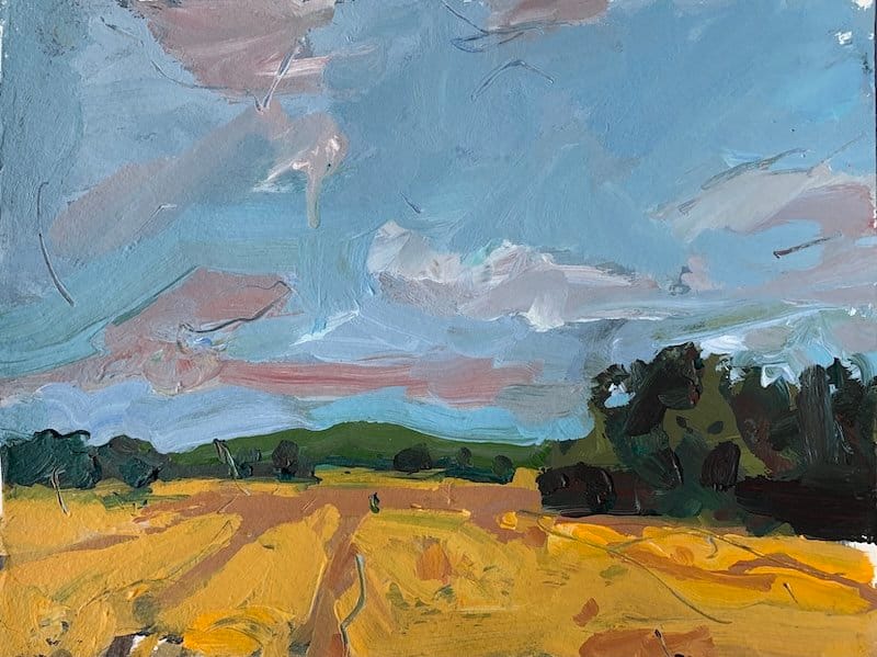
- Low Horizon for Big Skies
By placing the horizon low, I gave the sky dominance. More space, fewer land details—instant drama. - Light vs. Dark Balance
The sky and fields are kept light, with the trees acting as a strong dark band across the middle. This creates contrast without being overwhelming. - Large, Medium, Small Shapes
Good design avoids sameness. In this case: a large mass for the sky, a medium band of land, and small clusters of trees. That variety keeps the eye moving. - Simplified Cloud Masses
Instead of painting every puff, I kept the clouds close in value to the sky. This turned the sky into one unified mass instead of a patchwork of tiny shapes. - Perspective in the Fields
The subtle diagonal lines in the fields point toward the focal area, guiding the viewer’s eye naturally into the painting.
Garage Studio Note
Composition isn’t about being rigid—it’s about making deliberate choices. Think of it like setting the stage: once the backdrop is strong, the performance (your brushwork, color, and style) can shine.
Learn & Improve Your Acrylic Skills
- Acrylic Hub– Your go-to guide for tutorials, tips, and resources.
- Subscribe for More Great Content - Get tutorials, tips, and updates straight to your inbox.
- Follow Me on Pinterest - Daily inspiration, tips, and fresh ideas.
Recommended Acrylic Painting Materials
-
Princeton Catalyst Brushes – Flats (#6, #12), Rounds (#4, #8), Fan (#4), Liner Brush
Durable synthetic bristles for versatile acrylic techniques -
Liquitex Heavy Body Acrylic Paint – Essential Colors
Cadmium Yellow, Yellow Ochre, Alizarin Crimson, Cadmium Red Light, Ultramarine Blue, Cobalt Blue, Burnt Sienna, Titanium White -
Winsor & Newton Cotton Canvas
Reliable stretched canvas for studio and plein air work -
Strathmore 400 Series Mixed Media Paper
Heavyweight, acid-free paper for acrylic and mixed media -
Fabriano Artistico 140lb Cold Press Paper
Excellent for acrylic, mixed media, and textured effects -
Blick Multi-Colored Painting Knife Set
Variety of shapes for texture, scraping, and bold strokes - Miscellaneous: Two pint-sized water containers, paper towels (from Home Depot or Walmart)
- Note: I use canvas or sturdy cardboard as my palette — no store-bought palettes needed.