Beginner's Guide to Setting Up Your Watercolor Palette
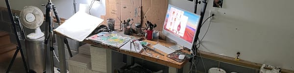
Setting up a watercolor palette isn’t rocket science. Start structured so you can learn the basics, then break the rules and find your own way. Here’s how I do it in the garage studio.


If you’re new to watercolor, setting up a palette can feel like rocket science. But it’s not. You don’t need 50 colors or a Pinterest-perfect layout. You just need a system that helps you find colors fast and mix them cleanly. That’s it.
Here’s my honest take: start with a structured palette. It’ll give you the most efficient way to learn the basics — washes, mixing, water-to-pigment ratios, all the stuff that builds a solid foundation.
But once you’re comfortable? Toss it out the window. Move colors around, skip the neat rows, don’t feel guilty about never cleaning it. I throw hues in random spots and work more off values than perfect color. It looks chaotic, but it works for me because I built that foundation first.
👉 Want step-by-step lessons? Visit the Watercolor Hub for tutorials and free courses.
Three Simple Ways to Organize a Palette
- Group by hue – Keep blues together, reds together, yellows together. Warm and cool versions side by side. Easy to navigate.
- Split warm and cool – Put all the warms on one side, all the cools on the other. Neutrals in their own section.
- Rainbow order – Red → orange → yellow → green → blue → violet. This is for folks who like seeing the spectrum laid out clean.
None of these is “right.” Try one, switch it up, make it messy, find what works for you.
Best Palette Setup
Skip ceramic. They chip and crack in a garage studio (ask me how I know). Go with a big plastic palette with separate mixing areas like the Masterson Aqua Pro. It won’t shatter when you drop it, and the large wells give you enough room to mix proper washes instead of tiny puddles.
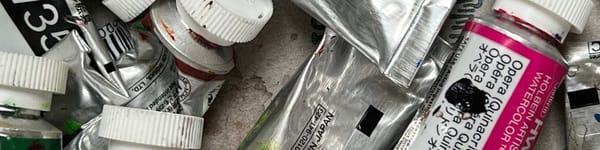
The Colors That Actually Work
Here’s a simple 10-color setup that will carry you far:
- Warm yellow → Yellow ochre
- Cool yellow → Cadmium lemon
- Warm blue → Ultramarine
- Cool blue → Cobalt
- Warm red → Cadmium red light
- Cool red → Alizarin crimson
- Neutrals → Burnt sienna, raw umber, neutral tint
- White gouache → For highlights when you need them
That’s it. Add a green or magenta if you’re feeling fancy, but don’t overload the thing. With these hues you can easily mix watercolors and achieve the proper secondary and tertiary colors.
How Much Paint to Squeeze
Don’t be stingy. Fill the wells. A pea-sized dab dries into a crust overnight. Load them heavy and cover your palette if you’re not painting for a while. Damp rag in a bag works if you need to keep it fresh for a week.
Cleaning It Out
Soap and water. Nothing heroic. If it’s been sitting for months, hit it with a hose in the driveway. Just don’t do it near your car unless you want watercolor racing stripes.
Final Thoughts
A well-set palette isn’t about being pretty. It’s about making painting easier. Group your colors in a way that makes sense to you, fill the wells, keep it clean, and you’re good.